A bold, typographically driven design with a focus on mobile usability.
With an aging non-mobile-friendly site, Northwest Film Forum needed to redesign mobile usability and functionality, update our look and feel, and take a holistic approach to better express where we are today. Partnering with Shore, a local branding and digital agency, we tasked ourselves with redefining our online presence to help users engage with our films and to equip our filmmaking community with helpful resources.

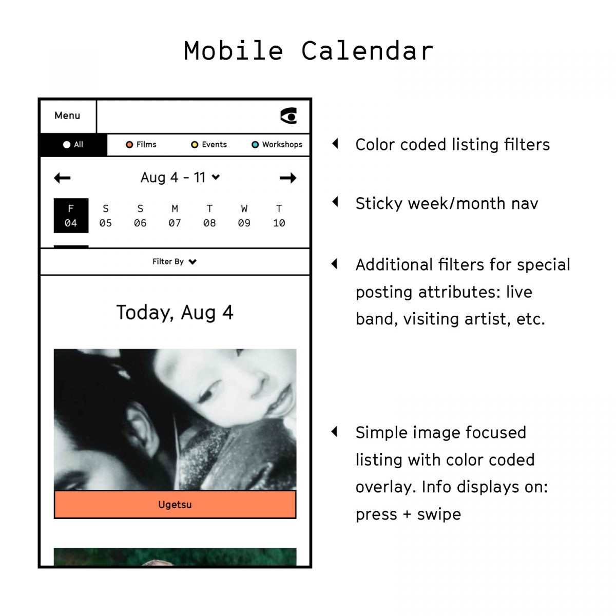
The overall site redesign took a mobile-first approach, defining smart content hierarchy and focusing first and foremost on a fun, unique, and intuitive calendar experience. Color coding of films, workshops, and events, and an additional icon system were introduced to help users understand the range of offerings at the Forum.

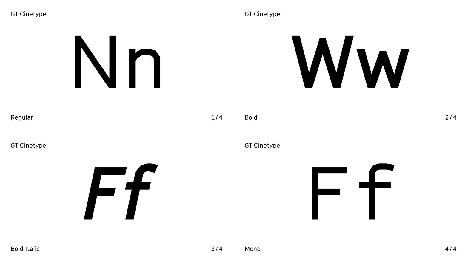
As a pillar of the new design, a unique typographic expression was needed to give the site a strong aesthetic and let us work in a wide range of sizes, content types, and information densities. We chose GT Cinetype, a design engineered for a cinema subtitling machine. By using a laser to erase the color layer of the film, very small and brilliantly white letters appear. The laser can only move in straight lines, so the typeface contains no curves. A conceptual match made in heaven. 👌
This article is authored by Shore, a local branding and digital agency.